Adaptive Websites: Show Less Once You Understand More
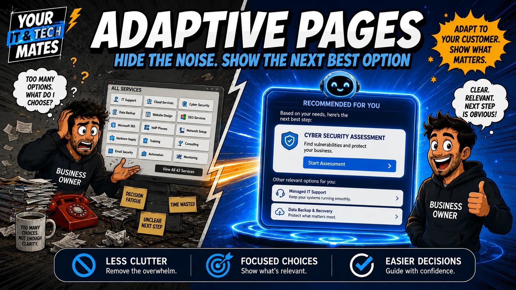
A smarter website does not need to show every option with equal weight after the customer’s need is confidently understood.
Quick answer
Adaptive presentation can simplify a page after the journey is confidently resolved by reducing duplicate or irrelevant choices. It should activate only under controlled conditions and always let the customer restore the full page.
Why too many choices create friction
A service website often accumulates cards, menus, buttons and pathways. Those are useful for discovery, but once a customer has clearly explained the problem, repeating every option can make the next step harder to see.
Confidence before simplification
The website should not collapse choices merely because a keyword appeared. A safer design requires a resolved recommendation state, a confidence threshold and no high-risk condition before entering a focused mode.
What can be simplified
Duplicate discovery cards, mismatched business or consumer pathways and repeated actions can be deemphasised or collapsed. Trust information, supporting guides and safety content remain available.
Why reversibility matters
The full canonical page should still exist. A visible control can restore every option, and changing or resetting the journey should return the page to normal discovery automatically.
What “show less” looks like in practice
Adaptive design should remove unnecessary choices, not hide important information. If a customer has already made it clear that the problem is a laptop screen, there is little value in continuing to show printer setup, Wi-Fi troubleshooting and phone support as equal next steps.
A better page can keep those alternatives available while making the likely path easier to see. If the customer later changes the problem, the journey can reopen the relevant choices.
Good adaptation
- prioritises the most relevant next action;
- keeps an easy “that is not right” route;
- does not remove safety or privacy information;
- does not make a booking or purchase decision for the customer;
- works consistently on mobile and for people who need larger, clearer controls.
The purpose is lower effort, not persuasion. The page should feel simpler because the website understands more, not because alternatives have been taken away.
Frequently asked questions
Does adaptive presentation hide content from search engines?
It should not require a separate crawler-only page. The canonical source can remain complete while the browser changes presentation for the current journey.
What if the system is uncertain?
Unknown, clarification and human-review states should keep broader discovery visible.
Can a customer show all options again?
Yes. Reversibility is an important trust and usability boundary.
Should safety content ever be collapsed?
No. High-risk journeys should use the dedicated safety path rather than ordinary commercial simplification.
Related Your IT and Tech Mates guidance
Could a similar customer journey help your business?
Tell us where customers repeat themselves, choose the wrong path or get stuck between your website and your real workflow. We can review whether better software, automation, AI or a simpler process change, would help. A person confirms scope and pricing before paid work starts.
Connect this guide to the wider Software & AI library
This topic is part of a wider customer-journey system. Use these related guides and first-party implementation examples for the next layer of detail.