Why Multiple-Choice Tech Support Forms Often Fail and What Works Better
Menus are useful when the answer is obvious. They become frustrating when customers are forced to choose a technical category they do not understand.
Quick answer
Multiple-choice support forms can force customers to diagnose their own problem. Learn how a hybrid guided approach can reduce guessing, repetition and wrong routing.
The hidden problem with support menus
Multiple-choice forms are designed around the organisation’s categories, not the customer’s mental model. A person who sees a frozen screen may not know whether to choose hardware, Windows, data, security or “other”.
Wrong choices create downstream friction
When the first category is wrong, every later question can become less relevant. The customer may abandon the form, repeat the story to a technician or receive a recommendation that does not fit the actual issue.
Menus are not the enemy
Structured choices are excellent when the customer knows the answer. “Windows or Mac?” and “Does another device connect?” can be quicker than typing. The problem is using menus as the only entry method.
A hybrid model works better
A stronger pattern is natural-language entry first, then one or two targeted choices. The system handles ambiguity, while buttons make clear factual answers fast.
Always include “Not sure”
Forcing a guess damages the quality of the journey. A “Not sure” option lets the support flow ask a different, easier question instead of treating uncertainty as bad data.
Measure whether questions actually help
The useful metric is not how many fields were completed. It is whether the customer reached the correct next step with less effort, fewer corrections and less repetition.
A realistic example: the printer problem that does not fit one box
A customer says, “My printer works from my phone but not from the family laptop.” A form may offer Printer, Wi-Fi, Computer, Software or Other. Every option is partly plausible. If the customer chooses Printer, the next page may focus on ink, paper jams and power. If they choose Wi-Fi, it may assume the whole network is offline. The form has forced a diagnosis before it has collected the symptom.
Old journey versus guided journey
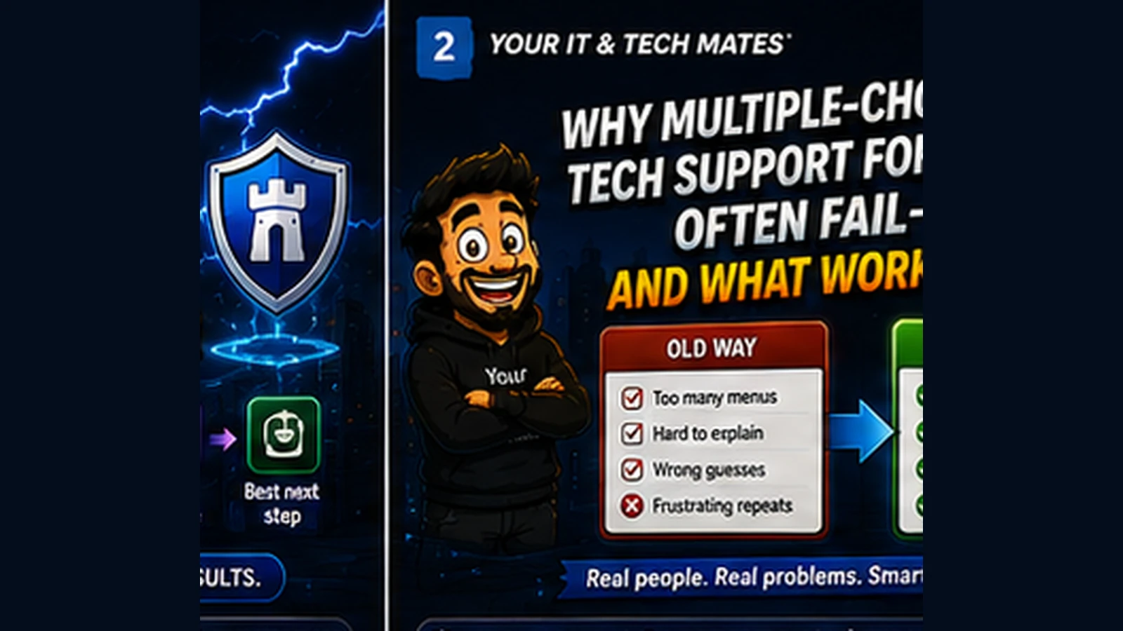
- Old journey: Pick the closest-looking category, follow advice based on that choice and backtrack if the category was wrong.
- Guided journey: Start with the observed problem, then use quick choices only when they clarify something meaningful, for example, “Does the printer work from another device?”
- Customer benefit: Fewer wrong branches, less backtracking and less pressure to understand support terminology before asking for help.
Why this matters for real customers
Wrong menu choices are not just a design inconvenience. They can lead to wasted time, unnecessary resets, irrelevant pricing information and poor handovers. A hybrid approach keeps the speed of buttons when the answer is obvious while allowing natural-language descriptions and a genuine “Not sure” path when it is not.
Menus should reduce effort, not transfer diagnosis to the customer
A useful support form asks for information the customer can reasonably know. “Which device is affected?” is usually answerable. “Is this a DNS, DHCP or adapter fault?” is usually not. Good design keeps technical classification behind the scenes.
Frequently asked questions
Are multiple-choice forms bad for tech support?
Not always. They work well for simple factual questions, but they are weaker when customers do not know the technical category.
Should every support form become a chatbot?
No. A hybrid of natural language, structured questions and normal forms is usually easier to control and easier for customers.
Why include a “Not sure” answer?
It prevents users from inventing an answer and allows the journey to collect the same information in a simpler way.
How this connects to our Guided Tools
Our Guided Tools are designed to let customers describe a problem naturally, answer a small number of relevant questions, review what the system understands and then choose the next step. Quick-choice tools remain available as a fallback, and QuoteMe stays customer-controlled.
Need help with a real tech problem?
Tell us what is happening in plain English. We will help you work out the most useful next step without expecting you to diagnose it first.