
How We Turned Our Own Website Into a Smarter Customer Help Journey
A plain-English look at how Your IT and Tech Mates changed its own website so customers can explain a problem once, see a clearer next step and keep human control over requests and paid work.
Quick answer
We changed our website around a simple idea: customers usually know what happened, not which internal service name to choose. The site can now start from ordinary wording, common choices or an optional photo, carry a small amount of useful context forward and show a clearer next step while QuoteMe and human review still control actual requests, prices and paid work.
The problem we wanted to reduce
A traditional service website often asks the customer to do too much translation. They see menus, service categories, pricing pages, guides and forms, then decide which one matches the problem. If they choose a form, they may type the same explanation again.
We wanted the website to do more of that organising while keeping the customer in control.
Step 1: start with what the customer can say
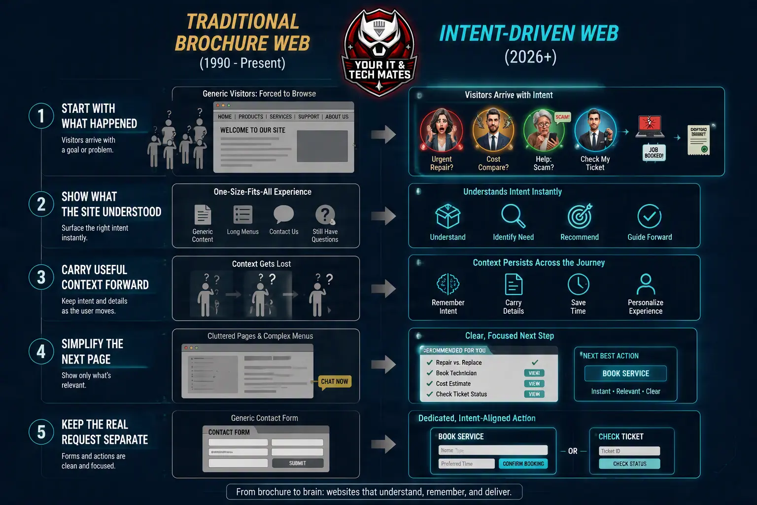
The main help entry now starts with ordinary wording: tell us what happened. Customers can also choose a common problem or add a useful photo where that helps.
Those are different ways to start the same journey, not separate request systems.
Step 2: show what the website understood
When there is enough information, the website can show the closest reviewed help area in plain English. If the wording is unclear, it can ask a short clarification rather than pretending to know more than it does.
The customer can change the wording or reset the interpretation.
Step 3: carry the useful part forward
A short-lived summary of the problem can follow the customer across suitable public pages so they do not immediately start from zero. That summary is intentionally different from verified customer history: it does not prove identity or unlock private requests.
Step 4: make the next page simpler
Once the likely goal is known, the website can bring forward the most relevant approved content and quieten less useful options. A repair customer can see repair help first. A scam-safety visitor can see safety guidance before commercial actions. A returning customer can be guided toward verified existing help instead of another new request.
Step 5: keep the real request separate
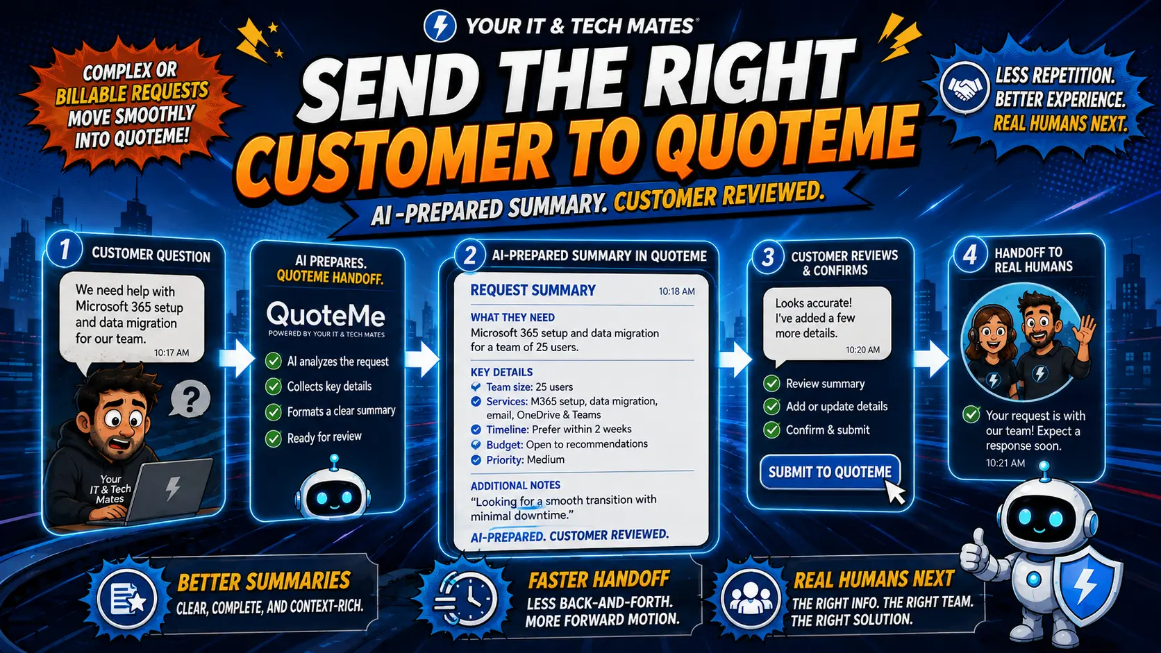
If the customer decides to ask for work, the website can prepare useful wording for the existing QuoteMe path. The customer reviews it and chooses whether to submit. QuoteMe remains the request owner; understanding the customer’s wording does not itself create a job, booking or approval.
What changed for the customer
- One clearer place to start.
- Less need to know technical service names.
- Fewer irrelevant choices once the goal is understood.
- Useful details can continue into the next step.
- Photos can add context without becoming an automatic diagnosis.
- Important actions still require an explicit customer or human decision.
What another business can learn from this
The useful lesson is not to copy our exact interface. Map the points where your customers hesitate or your staff repeatedly re-enter the same information. Then decide which parts should be clearer content, better forms, workflow automation, custom software or bounded AI assistance.
Our detailed implementation evidence is published separately in the Software & AI case-study series, so this guide can stay focused on what the journey feels like for a customer.
Continue into the Intent Intelligence build
Our original customer-journey article explains the experience. The newer AI intent engine build story goes deeper into routing, learning, corrections and how the engine keeps existing pricing and QuoteMe owners intact.
Frequently asked questions
Does the website automatically create a request when it understands the problem?
No. The customer still chooses whether to continue into QuoteMe and explicitly submits the request there.
Does a photo automatically diagnose the repair?
No. A photo can provide visible context, but diagnosis, scope, price and paid work still need the appropriate review.
Can the website recognise a returning customer from public browsing alone?
No. Private request information remains behind the existing verified customer-help process.
Why not just use a chatbot?
We wanted the useful context to improve the normal website journey rather than make customers restart inside a separate chat box.
Can another small business use the same approach?
The pattern can be adapted, but the right design depends on that business’s customer journey, existing systems, risks and approval requirements.
Could your customer journey be easier?
Tell us where customers repeat themselves, choose the wrong form or wait for staff to interpret an enquiry. We can review the workflow before recommending technology.
See how the journey continues across pages
The newer Intelligent Customer Journeys series extends this story into safe cross-page context, adaptive page simplification and journey-aware QuoteMe handover.